Showing posts with label CSS3. Show all posts
I am going to create beautiful menu using CSS3 transition effect. Observe below image. When user hover the menu text, the text color will change gradually character by character.  This type of effect can be created by simple CSS3 transition

Markup

Observe below markup. menu-link-default-txt is default text. menu-link-over is text to be displayed from 0% to 100% on mouse over, menu-link-default-txt will be hidden from 100% to 0%. 

Left To Right Animation

<a href="http://flaticon.sodhanalibrary.com/" class="menu-link menu-link-left" target="_blank">
   <div class="menu-link-txt">
    <div class="menu-link-default">
        <div class="menu-link-default-txt">My Blog</div>
    </div>
    <div class="menu-link-hover">My Blog</div>
   </div>
</a>
Click here to see DEMO

Left To Right Animation

<a href="http://flaticon.sodhanalibrary.com/" class="menu-link menu-link-right" target="_blank">
   <div class="menu-link-txt">
    <div class="menu-link-default">
        <div class="menu-link-default-txt">My Blog</div>
    </div>
    <div class="menu-link-hover">My Blog</div>
   </div>
</a>

CSS

.menu-link {
    display: block;
    padding: 14px 5px;
    color: #fff;
    overflow: hidden;
    font-size:100px;
}

.menu-link:before, .menu-link:after {
    content: '';
    position: absolute;
    left: 5px;
    bottom: 4px;
    width: 35px;
    height: 1px;
    background-color: #e9a065
}

.menu-link:before {
    -moz-transform: translate(-50%, 0) scale(0, 1);
    -ms-transform: translate(-50%, 0) scale(0, 1);
    -webkit-transform: translate(-50%, 0) scale(0, 1);
    transform: translate(-50%, 0) scale(0, 1);
    -moz-transition: all 1s cubic-bezier(0.165, 0.84, 0.44, 1);
    -o-transition: all 1s cubic-bezier(0.165, 0.84, 0.44, 1);
    -webkit-transition: all 1s cubic-bezier(0.165, 0.84, 0.44, 1);
    transition: all 1s cubic-bezier(0.165, 0.84, 0.44, 1)
}

.menu-link:after {
    -moz-transition: all 1s cubic-bezier(0.77, 0, 0.175, 1);
    -o-transition: all 1s cubic-bezier(0.77, 0, 0.175, 1);
    -webkit-transition: all 1s cubic-bezier(0.77, 0, 0.175, 1);
    transition: all 1s cubic-bezier(0.77, 0, 0.175, 1)
}

.menu-link:hover:before {
    -moz-transform: translate(0%, 0) scale(1, 1);
    -ms-transform: translate(0%, 0) scale(1, 1);
    -webkit-transform: translate(0%, 0) scale(1, 1);
    transform: translate(0%, 0) scale(1, 1);
    -moz-transition: all 1s cubic-bezier(0.77, 0, 0.175, 1);
    -o-transition: all 1s cubic-bezier(0.77, 0, 0.175, 1);
    -webkit-transition: all 1s cubic-bezier(0.77, 0, 0.175, 1);
    transition: all 1s cubic-bezier(0.77, 0, 0.175, 1)
}

.menu-link:hover:after {
    -moz-transform: translate(50%, 0) scale(0, 1);
    -ms-transform: translate(50%, 0) scale(0, 1);
    -webkit-transform: translate(50%, 0) scale(0, 1);
    transform: translate(50%, 0) scale(0, 1);
    -moz-transition: all 1s cubic-bezier(0.165, 0.84, 0.44, 1);
    -o-transition: all 1s cubic-bezier(0.165, 0.84, 0.44, 1);
    -webkit-transition: all 1s cubic-bezier(0.165, 0.84, 0.44, 1);
    transition: all 1s cubic-bezier(0.165, 0.84, 0.44, 1)
}

.menu-link:hover .menu-link-default {
    width: 0%
}

.menu-link:hover .menu-link-hover {
    width: 100%;
    opacity: 1;
}

.menu-link-left .menu-link-txt {
    float: left;
    position: relative
}

.menu-link-left .menu-link-default {
    float: right;
    width: 100%;
    padding: 5px 0;
    white-space: nowrap;
    -moz-transition: all 1s cubic-bezier(0.77, 0, 0.175, 1);
    -o-transition: all 1s cubic-bezier(0.77, 0, 0.175, 1);
    -webkit-transition: all 1s cubic-bezier(0.77, 0, 0.175, 1);
    transition: all 1s cubic-bezier(0.77, 0, 0.175, 1);
    overflow: hidden
}

.menu-link-left .menu-link-default-txt {
    float: right
}

.menu-link-left .menu-link-hover {
    position: absolute;
    left: 0;
    top: 0;
    opacity:0;
    width: 0%;
    padding: 5px 0;
    color: #e9a065;
    white-space: nowrap;
    overflow: hidden;
    -moz-transition: all 1s cubic-bezier(0.77, 0, 0.175, 1);
    -o-transition: all 1s cubic-bezier(0.77, 0, 0.175, 1);
    -webkit-transition: all 1s cubic-bezier(0.77, 0, 0.175, 1);
    transition: all 1s cubic-bezier(0.77, 0, 0.175, 1)
}

.menu-link-right .menu-link-txt {
    float: right;
    position: relative
}

.menu-link-right .menu-link-default {
    float: left;
    width: 100%;
    padding: 5px 0;
    white-space: nowrap;
    -moz-transition: all 1s cubic-bezier(0.77, 0, 0.175, 1);
    -o-transition: all 1s cubic-bezier(0.77, 0, 0.175, 1);
    -webkit-transition: all 1s cubic-bezier(0.77, 0, 0.175, 1);
    transition: all 1s cubic-bezier(0.77, 0, 0.175, 1);
    overflow: hidden
}

.menu-link-right .menu-link-default-txt {
    float: right;
    width:100%;
}

.menu-link-right .menu-link-hover {
    position: absolute;
    right: 0;
    top: 0;
    width: 0%;
    padding: 5px 0;
    color: #e9a065;
    white-space: nowrap;
    overflow: hidden;
    opacity:0;
    width: 100%;
    -moz-transition: all 1s cubic-bezier(0.77, 0, 0.175, 1);
    -o-transition: all 1s cubic-bezier(0.77, 0, 0.175, 1);
    -webkit-transition: all 1s cubic-bezier(0.77, 0, 0.175, 1);
    transition: all 1s cubic-bezier(0.77, 0, 0.175, 1)
}
Read More
Sometimes we need to block website UI while loading data in Ajax. For this purpose you might have prefer some plugins, but its easy to create this functionality with AngulaJS and CSS3. Here we are going  to implement this

Align loading style div or GIF to the middle of page

Make this div as absolute in position. 
Left position : calc (50% - (width of loading div/2))
Right position : calc (50vh - (height of loading div/2))
It should be displayed on top of all elements, So give maximum possible z-index.

Observe below CSS
#blockUiDiv {
    background-color: transparant;
    width:194px;
    height:194px;
    position:absolute;
    left:calc(50% - 97px);
    top:calc(50vh - 97px);
    display:none;
    z-index: 20001;
}

#blockUiDiv img {
    width:194px;
    height:194px;
}

The above loading div covers only small amount of area. But we have to block entire screen. So we need backdrop for this div. This backdrop should cover entire screen, So make this as fixed at (0,0)  with 100% width and 100vh height. z-index of this backdrop must be less than above loading div

Observe below CSS
#blockUiBackdrop {
    height: 100vh;
    width: 100%;
    z-index: 20000;
    position: fixed;
    top: 0;
    left: 0;
    background-color: #000;
    opacity: 0.5;
    -webkit-transition: all 0.5s ease;
    -moz-transition: all 0.5s ease;
    -o-transition: all 0.5s ease;
    transition: all 0.5s ease;
    display:none;
}

HTML Code

The below highlighted variable is responsible for blocking and unblocking UI
<div id="blockUiDiv" ng-show="showBlockUI">
  <img src="wave.svg"/>
</div>
<div id="blockUiBackdrop" ng-show="showBlockUI">
</div>

Block UI and unBlock UI

The below functions represent block and unblock UI functionalities
$scope.blockUI = function() {
        $scope.showBlockUI = true;
        $scope.$apply();
};

$scope.unBlockUI = function() {
        $scope.showBlockUI = false;
        $scope.$apply();
};

Trigger ajax call

This below function blocks UI before it trigger AJAX call and unblock ui after completing ajax call
$scope.triggerAjaxCall = function(delay) {
    $scope.blockUI();
    $http.get('/GetDelayedText?milliSeconds='+delay).
     success(function(data, status, headers, config) {
        alert(data);
        $scope.unBlockUI(); 
     }).error(function(data, status, headers, config) {
        alert(data);
        $scope.unBlockUI();
     }); 
};

Handling multiple ajax calls

If we trigger multiple calls at a time, then it should not unblock UI for other ajax call. Take one global variable and increment it when ajax call triggered, decrement it when ajax call end. Find below for code
$scope.blockUiVar = 0;
    
$scope.blockUI = function() {
    if($scope.blockUiVar == 0) {
        $scope.showBlockUI = true;
        $scope.$apply();
    }
    $scope.blockUiVar++;
};

$scope.unBlockUI = function() {
    if($scope.blockUiVar == 1) {
        $scope.showBlockUI = false;
        $scope.$apply();
    }
    $scope.blockUiVar--;
};
Read More
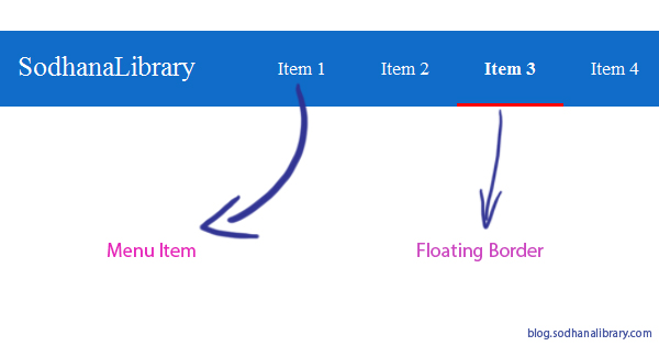
This is special for material design in which everything has to transform in animated way. Whenever user clicks on menu item, the selected border has to move. Lets implement this menu with CSS3 and jQuery

Make all elements normal

Whenever we define padding and margin to elements,  It will be confused if that element width or height changes. So define these CSS
* {
box-sizing:border-box;
padding:0px;
margin:0px;
}

Make header

Here header is of two parts. Left side brand name will be there, Right side menu will be there
/* header CSS */
.header {
  background-color: rgb(16, 108, 200);
  /* this property will make float divs widths to be included*/
  overflow: hidden;
  color: white;
  width:100%;
  position:relative;
}

/* for brand name display */
.header .brand{
  float:left;
  padding:18px;
  font-size:25px;
}

/* menu div */
.header .menu {
  float:right;
}

Make Menu

Take unordered list as menu, put items into that list as menu items. Find below for CSS
/*menu CSS*/
.menu ul {
  display:inline-flex;
  list-style:none;
  margin:0px;
  padding:0px;
}

.menu ul li{
  padding:25px;
  font-size:17px;
  cursor:pointer;
}

.menu ul li:hover{
  background-color:rgb(36, 128, 220);
}

/* this class is to show selected menu item */
.active{
  font-weight:bold;
}

Make Floating Border

Whenever user clicks on menu item, Border has to float to that position
/* this will represent border and it will move when user select  */
.borderDiv {
  position: absolute;
  background-color: #F00;
  right: 0px;
  width: 0;
  top: 67px;
  height: 3px;
  z-index: 1;
  /* transition effects to animation transformation*/
  -webkit-transition: all 0.5s ease;
  -moz-transition: all 0.5s ease;
  -o-transition: all 0.5s ease;
  transition: all 0.5s ease;
}

jQuery Code

Whenever user clicks on item, active class will be added to selected item. Now compute borderDiv css to fixed right
$(function() {
    $(".menu ul li").click(function() {
        $(".menu ul li").removeClass("active"); 
        $(this).addClass("active");
        $(".borderDiv").css('right', $(document).width() - ($(this).position().left + $(this).outerWidth()));
        $(".borderDiv").css('width', $(this).outerWidth());
    });
});
Read More
Sometimes we need to block website UI while loading data in Ajax. For this purpose you might have prefer some plugins, but its easy to create this functionality with jQuery and CSS3. Here we are going  to implement this

Align loading style div or GIF to the middle of page

Make this div as absolute in position. 
Left position : calc (50% - (width of loading div/2))
Right position : calc (50vh - (height of loading div/2))
It should be displayed on top of all elements, So give maximum possible z-index.

Observe below CSS
#blockUiDiv {
    background-color: transparant;
    width:194px;
    height:194px;
    position:absolute;
    left:calc(50% - 97px);
    top:calc(50vh - 97px);
    display:none;
    z-index: 20001;
}

#blockUiDiv img {
    width:194px;
    height:194px;
}

The above loading div covers only small amount of area. But we have to block entire screen. So we need backdrop for this div. This backdrop should cover entire screen, So make this as fixed at (0,0)  with 100% width and 100vh height. z-index of this backdrop must be less than above loading div

Observe below CSS
#blockUiBackdrop {
    height: 100vh;
    width: 100%;
    z-index: 20000;
    position: fixed;
    top: 0;
    left: 0;
    background-color: #000;
    opacity: 0.5;
    -webkit-transition: all 0.5s ease;
    -moz-transition: all 0.5s ease;
    -o-transition: all 0.5s ease;
    transition: all 0.5s ease;
    display:none;
}

Block UI and unBlock UI

The below functions represent block and unblock UI functionalities
function blockUi() {
    $("#blockUiDiv").show();
    $("#blockUiBackdrop").show();
}

function unBlockUi() {
    $("#blockUiDiv").hide();
    $("#blockUiBackdrop").hide();
}

Trigger ajax call

This below function blocks UI before it trigger AJAX call and unblock ui after completing ajax call
// this function is for trigger ajax call
// it will block the UI at starting of ajax call and unblock UI at end of ajax call
function triggerAjaxFunction(milliSeconds) {
    blockUi();
    $.ajax({
        type: "GET",
        url: '/GetDelayedText?milliSeconds='+milliSeconds,
        success: function(data) {
            // success response
            alert(data);
        },
        error: function(data) {
            // error response
            alert(data);
        },
        complete: function(data) {
            // end of ajax call
            unBlockUi(); 
        }
    });
}

Handling multiple ajax calls

If we trigger multiple calls at a time, then it should not unblock UI for other ajax call. Take one global variable and increment it when ajax call triggered, decrement it when ajax call end. Find below for code
var blockUiVar = 0;

function blockUi() {
    if(blockUiVar == 0) {
        $("#blockUiDiv").show();
        $("#blockUiBackdrop").show();   
    }
    blockUiVar++;
}

function unBlockUi() {
    if(blockUiVar == 1) {
        $("#blockUiDiv").hide();
        $("#blockUiBackdrop").hide();
    }
    blockUiVar--;
}
Read More
This article was inspired by Google Login Form UI. This below UI is simple and it displays Login, Register and Forgot-Password panel in on same screen.

Form Structure

<form class="panel" id='login' action='' method='post'>
    ..........
</form>
<form class="panel" id='forgotpassword' action='' method='post'>
    ..........
</form>
<form class="panel" id='register' action='' method='post'>
    .........
</form>

Switch Panel Triggers 

<a class="switchPanelButton" panelclass="panel" panelid="forgotpassword" href="#"> Forgot password </a>

jQuery Code to Switch Panels 

$(".switchPanelButton").click(function(event){
    event.preventDefault();
    var panel = $(this).attr('panelclass');
    $("."+panel).hide();
    var panelid = $(this).attr('panelid');
    $("#"+panelid).show();
});
Read More
By using Hours and Minutes rotation animation keyframes we can create Clock Loader.

Markup

<div class="panel">
    <div class="b-loader"></div>
</div>

CSS3

.panel {
  background:#2fc7f7;
  position:relative;
}

.b-loader {
  width: 84px;
  height: 84px;
  border: 2px solid #ffffff;
  border-radius: 50%;
  position: absolute;
  z-index: 60;
  top: 50px;
  left: 50%;
  margin-left: -44px;
}


.b-loader:before,
.b-loader:after {
  content: ' ';
  background: url(/img/loader-arrow.png) 50% 50% no-repeat;
  position: absolute;
  top: 0;
  left: 0;
  width: 100%;
  height: 100%;
}


.b-loader:before {
  -o-animation: fxRotateMinute 500ms linear infinite;
  -moz-animation: fxRotateMinute 500ms linear infinite;
  -webkit-animation: fxRotateMinute 500ms linear infinite;
  -webkit-animation: fxRotateMinute 500ms linear infinite;
}

.b-loader:after {
  -o-animation: fxRotateHour 3000ms linear infinite;
  -moz-animation: fxRotateHour 3000ms linear infinite;
  -webkit-animation: fxRotateHour 3000ms linear infinite;
  -webkit-animation: fxRotateHour 3000ms linear infinite;
}

@-o-keyframes fxRotateMinute {
  from {
    -o-transform: rotate(0);
  }
  to {
    -o-transform: rotate(1turn);
  }
}
@-moz-keyframes fxRotateMinute {
  from {
    -moz-transform: rotate(0);
  }
  to {
    -moz-transform: rotate(1turn);
  }
}
@-webkit-keyframes fxRotateMinute {
  from {
    -webkit-transform: rotate(0);
  }
  to {
    -webkit-transform: rotate(1turn);
  }
}
@-webkit-keyframes fxRotateMinute {
  from {
    -webkit-transform: rotate(0);
  }
  to {
    -webkit-transform: rotate(1turn);
  }
}

@-o-keyframes fxRotateHour {
  from {
    -o-transform: rotate(0.25turn);
  }
  to {
    -o-transform: rotate(1.25turn);
  }
}
@-moz-keyframes fxRotateHour {
  from {
    -moz-transform: rotate(0.25turn);
  }
  to {
    -moz-transform: rotate(1.25turn);
  }
}
@-webkit-keyframes fxRotateHour {
  from {
    -webkit-transform: rotate(0.25turn);
  }
  to {
    -webkit-transform: rotate(1.25turn);
  }
}
@-webkit-keyframes fxRotateHour {
  from {
    -webkit-transform: rotate(0.25turn);
  }
  to {
    -webkit-transform: rotate(1.25turn);
  }
}
Read More
We can design menu button in an interactive way like displaying different shapes with animation . Observe the below diagram for shapes with user actions.

HTML Markup 

<div class="side-nav">
  <button class="navbar-toggle">
    <span class="sr-only">Toggle navigation</span>
    <span class="icon-bar top"></span>
    <span class="icon-bar middle"></span>
    <span class="icon-bar bottom"></span>
  </button>
  <div class="menuPanel">
  </div>
</div>

CSS 

.sr-only {
    position: absolute;
    width: 1px;
    height: 1px;
    margin: -1px;
    padding: 0;
    overflow: hidden;
    clip: rect(0, 0, 0, 0);
    border: 0
}

.navbar-toggle {
    position: relative;
    float: right;
    margin-right: 15px;
    padding: 9px 10px;
    margin-top: 23px;
    margin-bottom: 23px;
    border: 1px solid transparent;
    border-radius: 1px;
    cursor:pointer;
    z-index:1;
}

.navbar-toggle:focus {
    outline: none
}

.navbar-toggle .icon-bar {
    display: block;
    width: 22px;
    height: 2px;
    border-radius: 1px
}

.navbar-toggle .icon-bar+.icon-bar {
    margin-top: 4px
}

.navbar-toggle {
    display: block;
    background: #2fc7f7;
    float: none;
    width: 75px;
    height: 75px;
    border-radius: 0;
    margin-right: 15px;
    padding: 10px 15px;
    margin-top: 8px;
    margin-bottom: 8px
}

.navbar-toggle:hover {
    -webkit-transition: margin-bottom 500ms ease-in-out;
    transition: margin-bottom 500ms ease-in-out
}

.navbar-toggle:hover span.icon-bar {
    position: relative
}

.navbar-toggle:hover span.icon-bar.top {
    top: 7.5px;
    -webkit-transform: rotate(90deg);
    -ms-transform: rotate(90deg);
    transform: rotate(90deg)
}

.navbar-toggle:hover span.icon-bar.middle {
    left: 0px;
    position: relative
}

.navbar-toggle:hover span.icon-bar.bottom {
    bottom: 7.5px;
    position: relative;
    -webkit-transform: rotate(-90deg);
    -ms-transform: rotate(-90deg);
    transform: rotate(-90deg)
}

.navbar-toggle span.icon-bar {
    background: #fff;
    display: block;
    width: 40px;
    height: 4px;
    border-radius: 1px;
    -webkit-transform: rotate(0deg);
    -ms-transform: rotate(0deg);
    transform: rotate(0deg);
    -webkit-transition: all 300ms ease-in-out;
    transition: all 300ms ease-in-out
}

.navbar-toggle.active {
    -webkit-transition: all 300ms ease-in-out;
    transition: all 300ms ease-in-out
}

.navbar-toggle.active span.icon-bar {
    position: relative;
    -webkit-transition: all 300ms ease-in-out;
    transition: all 300ms ease-in-out
}

.navbar-toggle.active span.icon-bar.top {
    -webkit-transform: rotate(-45deg);
    -ms-transform: rotate(-45deg);
    transform: rotate(-45deg);
    top: 0px
}

.navbar-toggle.active span.icon-bar.middle {
    width: 0;
    height: 0;
    margin: 0 auto
}

.navbar-toggle.active span.icon-bar.bottom {
    -webkit-transform: rotate(45deg);
    -ms-transform: rotate(45deg);
    transform: rotate(45deg);
    margin: 0;
    top: -4px;
}
.menuPanel {
    background: #2fc7f7;
    font-size:40px;
    padding:60px 40px 40px 80px;
    display:none;
    position:absolute;
    top:0px;
    color:#fff;
    line-height:60px;
}

.side-nav {
    position:relative;
    margin:auto;
    width:500px;
}

.side-nav a{
    color:#fff;
    text-decoration:none;
}

jQuery Code

$(function(){
    $(".navbar-toggle").click(function(){
        $(this).toggleClass("active");
        $(this).next(".menuPanel").slideToggle();
    });
});
Read More

Blogroll

Popular Posts